well-temperedforum.groupee.net
Looks like modern identitarian politics had a rollout date
--------------------------------
If you think looting is bad wait until I tell you about civil forfeiture.
29 May 2019, 11:13 AM
Piano*DadI have a big problem with "big data" counting exercises like this. What does it tell us?
Surely it means that social problems suddenly worsened ...
Maybe it means that the NYT newsroom brass decided to push certain themes.
Maybe ... well, actually we have no idea what it means because these word counting exercises do not constitute an empirical methodology.
Maybe it's a function of selective word choices. Perhaps other equally interesting words that describe the same set of phenomena were replaced by these words instead, so nothing real happened in the reporting.
Maybe a bunch of word counters with an agenda decided to highlight THESE words to tell THEIR story about America.
We really don't know what this means, because there is no causal logic being tested.
At some point in the next few days, Inside Higher Education is running a little article of mine on the proliferation of "studies" that have no empirical methodology, and yet capture a lot of attention...

29 May 2019, 11:49 AM
jon-nycTo a certain extent you seem to be objecting to conclusions that aren’t actually presented. IOW, this is some loose data, not a ‘study’.
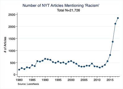
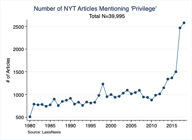
As for myself, the timing was not a surprise, I had previously considered 2013 as a critical turning point, as if this is what the media turned its attention to once the election ended.
The magnitude was a bit of a shock.
--------------------------------
If you think looting is bad wait until I tell you about civil forfeiture.
29 May 2019, 12:09 PM
jon-nycThe NYT used to have an online tool where you could track word usage over time in their pages. They disabled it eventually. It seems that it was mostly used by their critics to try to demonstrate the extent of narrative driving they engage in.
--------------------------------
If you think looting is bad wait until I tell you about civil forfeiture.
29 May 2019, 12:32 PM
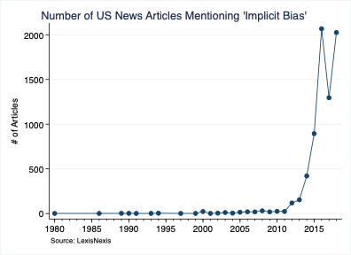
QuirtEvansYou will note that the categories change. Sometimes, it's NYT articles. Sometimes, it's news articles. Sometimes, it's US news articles.
I wonder why it's inconsistent?
Actually, I don't really wonder.
29 May 2019, 12:35 PM
jon-nycI can tell you! He started with all articles traced by Lexis/Nexis, then commenters pointed out that the universe of publications they tracked might have proliferated over time. So he switched to a single publication and found the same result. (He responded to commenters real time, he was tweeting these as he did them. I didn’t conserve his order).
--------------------------------
If you think looting is bad wait until I tell you about civil forfeiture.
29 May 2019, 12:54 PM
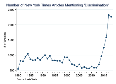
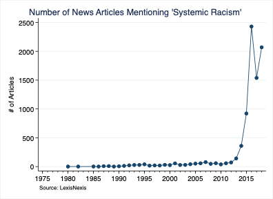
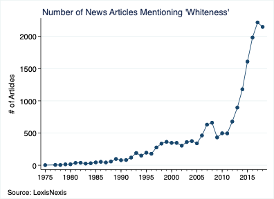
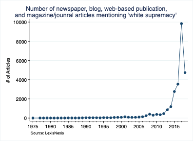
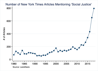
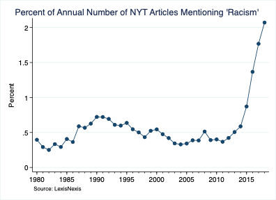
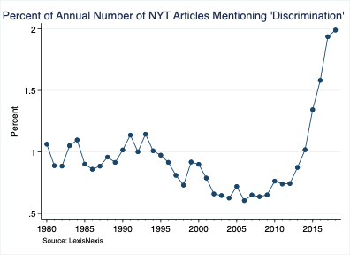
Mary AnnaThe horizontal axes shift a bit, wandering around between 1975 and 2001. The vertical axis changes, too, from 800 to 20,000.
Without trying to guess at causality, it seem pretty clear that all the curves head upward within the past few years, but the decision to print all the tables so that the increase looks equal in all cases wasn't the best idea, in my opinion.
For instance, on the graphs with a huge number at the top of the vertical axis, it would be difficult to see smaller, earlier blips that could show something interesting.
One could wonder whether the graph-makers were trying to prove a point by constructing the graphs in this way, but it's more likely that they just pushed a button and asked the graphics program to optimize the graphs for them.
29 May 2019, 01:06 PM
jon-nycWe all lived through this, too. Surely this doesn’t come as a particular surprise to anyone? I don’t mean the nitty-gritty details, but in outline?
--------------------------------
If you think looting is bad wait until I tell you about civil forfeiture.
29 May 2019, 02:44 PM
jon-nycInteresting to compare this to polling on attitudes about racism. The public’s increasing concern about racism (as per Gallup anyway) seems to have lagged the increased press attention by a year or two
ergo propter hochttps://news.gallup.com/poll/1687/Race-Relations.aspx
--------------------------------
If you think looting is bad wait until I tell you about civil forfeiture.
29 May 2019, 09:20 PM
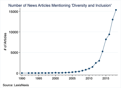
jon-nycSame guy has re-tabulated as %age of all articles to rule out proliferation of articles as an explanation for the increased incidence of terms.
e.g.:
--------------------------------
If you think looting is bad wait until I tell you about civil forfeiture.
30 May 2019, 12:35 PM
Ninaquote:
Originally posted by Mary Anna:
The horizontal axes shift a bit, wandering around between 1975 and 2001. The vertical axis changes, too, from 800 to 20,000.
Without trying to guess at causality, it seem pretty clear that all the curves head upward within the past few years, but the decision to print all the tables so that the increase looks equal in all cases wasn't the best idea, in my opinion.
For instance, on the graphs with a huge number at the top of the vertical axis, it would be difficult to see smaller, earlier blips that could show something interesting.
One could wonder whether the graph-makers were trying to prove a point by constructing the graphs in this way, but it's more likely that they just pushed a button and asked the graphics program to optimize the graphs for them.
Nerd alert: I have this discussion with my bosses all the time. I'm a big fan of making the axes fit the data. If this means the Y axis doesn't end at 0, so be it. If it means that the scales from one graph to another aren't the same, that's fine too. My argument is that graphs show patterns and shapes as much if not more than actual numerical values (which are better served in a table or as callouts, IMO). The exception is when you are really trying to directy compare different measurements--in which case, why not put them on the same graph in the first place?
Nerd alert off.
30 May 2019, 03:33 PM
Mary AnnaThank you for the nerd alert, Nina.
Does that graph-designing logic explain why the police brutality x-axis begins in 2001, while most of the others begin years or decades earlier?
Because otherwise one would wonder whether the graph-maker was purposely trying to exclude coverage of Rodney King or the as-I-recall-it pretty significant conversation about police brutality in the 1970s.
Were these graphs published anywhere? That misspelling of "journal" in the fifth one from the bottom argues against it.
30 May 2019, 04:30 PM
jon-nycThey were published real time on twitter as he produced them, and he responded to feedback as they were being published which caused him to change the way he was doing it (all pubs to one pub, # to %age, etc).
I can't imagine why he would want to hide a bump of uses of 'police brutality' from previous decades, what salient point do you think that might undermine?
Of course this was a quick, ad hoc exercise. But I think it pretty clearly demonstrates that the language of modern critical race theory was rolled out pretty hard starting roughly 5-6 years ago. To use Andrew Sullivan's words, the 'Great Awokening' is real.
By the way, the author of the graphs made no specific claims as to why or how this happened. In fact I think he only prefaced this with something to the effect of "whether this disturbs you or encourages you, I think we can all say 'wow'."
--------------------------------
If you think looting is bad wait until I tell you about civil forfeiture.
30 May 2019, 05:10 PM
NinaGeorge Zimmerman and the birth of the BLM movement--2013--seems to correspond to both these graphs and my memory of when racism and other "isms" became part of the national conversation.
30 May 2019, 06:28 PM
QuirtEvansMy reaction is that, around 2013, people who had previously sighed and accepted certain things started saying, "that's enough. No more."
It also corresponds to the rise of social media as a communication mechanism.
But, if you're invested in Andrew Sullivan's theology, I suppose those explanations are too benign.