
Go | New | Find | Notify | Tools | Reply |
| Great data visualization | Login/Join |
| Has Achieved Nirvana |
Some folks are great at packing a lot of information into a picture. Visualizing Congressional Productivity: https://datainnovation.org/202...placement=newsletter
| ||
|
| Beatification Candidate |
I always like to see a good visualization. I have some books in my library on that exact topic with examples going back to at least John Snow's map of the 1854 London cholera epidemic: 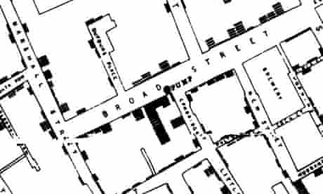 Florence Nightingale made good use of visual presentations as noted in this article: The Defiance of Florence Nightingale Big Al
| |||
|
Minor Deity |
It is good visualization. I would question the term productivity. The federal government was never intended to pass lots of laws, only when there was significant consensus.
| |||
|
| Has Achieved Nirvana |
dataisbeautiful on Reddit. Lots of rabbit holes, Big Al. https://www.reddit.com/r/dataisbeautiful/
| |||
|
| Powered by Social Strata |
| Please Wait. Your request is being processed... |