Go  | New  | Find  | Notify  | Tools  | Reply  |  |
| Has Achieved Nirvana |
Those are very good pictures and I don't see any reason to pay a pro. FWIW, I also like #3.
| |||
|
| Pinta & the Santa Maria Has Achieved Nirvana |
Hmmm. I like the red jacket, but think the photo needs to be cropped. I think the angle of your arm and the curve of the tree are nice. Agree that the sunglasses might be off-putting. It bugs me that there's that chiseled "R Officer" graffiti on #1. I find that very distracting. I actually like #2 and #6. #2 - your hair doesn't bug me, but if you zoom in, perhaps it falls apart. I'd check that, since you really have no control over what happens to the shot itself, once it gets out there. #3 - The foreground leaf is too, well, foreground for me. Question: in my mind's eye, author photos are head shots. These aren't. Do I need a reset? But you look fab in all of them! | |||
|
| czarina Has Achieved Nirvana  |
I'm on the horns of the same dilemma at the moment, and I do understand. I think you don't have the right photo yet. Each of these pictures has something that works, but doesn't quite come together. My suggestion: smile, lose the shades, and use the lighting in the last photo--and the red jacket in that photo is very good, too. The non-smiling ones and the sunglasses ones just look too severe. And you are too hard on yourself--You look fit, not fat, and your hair is glorious. I'm going to have to contend with a huge gray streak that wasn't there in 2009.
| |||
|
| Unrepentant Dork Gadfly |
I think you look fabulous in all of them and I love them. But I’m not sure they are what you want for a headshot. Here’s a horrible thing to say but I think it’s true. If you were male, any of these would work. Men can get away with far more than women in author headshots. Men can go casual and quirky and it doesn’t matter. Women are judged differently. Maybe I’m wrong, but my gut says that’s true. Here’s some (hopefully) constructive criticism about the photos: The background is too interesting. It’s a headshot so the focus needs to be you. While the background is great for an interesting photo, it pulls the focus. I would advise the photographer to use a shallower depth of field to make you “pop” from the background. This may be the result of the upload and photo hosting, but they aren’t crisp enough. To me, that jumps out as “amateur”. Again, that may be the result of lower quality in the hosting site. I don’t like the sunglasses. They look great on you, but they add to the “candid” vibe. The light is not great for what you are trying to accomplish. The same photos taken at a different time of day or in open shade would work far better. When you are getting photos taken, resist the urge to tilt your head up. It’s instinct - we think it will help with a double chin or whatever - but it actually does the opposite. Keep your chin down a touch. All that said, you really do look fantastic! I love the photos, but I think a few tweaks to the photography itself might make you happier! Also, maybe I’m completely wrong about all things. I’m definitely an amateur and I’ve never done author shots!
| |||
|
Has Achieved Nirvana |
FWIW, I like #2. | |||
|
| Unrepentant Dork Gadfly |
Jumping back in, I would say if you were picking any of these go with #1. The lighting is good, and it has personality. Edited to add: your wardrobe instinct is perfect. Change none of that.
| |||
|
Minor Deity |
Your comments are lovely and much appreciated. We went to the botanical gardens in OKC and took more that respond to your thoughts. I’ll post some of them later tonight. Thanks, y’all!
| |||
|
| Minor Deity |
You are too darn cute! That said, for your purpose, smile! Waist up. Hard in sun to not have glasses get dark. Maybe try it without if you don't squint too much. I like 1 the best. But I was immediately distracted to read the Writing! ;-)
| |||
|
| (self-titled) semi-posting lurker Minor Deity |
Writing on my phone so this may be brief. But I agree with some of the other comments that 1) you look wonderful but 2) some different shots might work better. Some of the best best photos I’ve had of myself were taken with an iPhone in the middle of the day when there’s a ton of good light but I’m completely in the Shade. That way there are no weird shadows and no weird squinting. Having said that, the photo I now use as my profile photo was one that was taken by a pro (I won an award and my college paid for me to get fancy headshots and then they never published the article about my award. But I still got the headshots. Anyway, I was amazed at the difference b/w the nice outdoor photos w/ iPhone’s portrait mode and the pro’s shots. No contest the pro shots were a billion times better. Which is all to say, see if you can get some pro shots, but in the meantime, please share the. botanical garden shots with us!!
| |||
|
| knitterati Beatification Candidate  |
I like 3 and 4. But I would crop.
| |||
|
Minor Deity |
We went to the OKC botanical gardens and tried to take more closeups and more smiles. None have sunglasses! The light wasn't as harsh, so I didn't have as much trouble with squinting. Dol, I don't know whether the resolution is reduced by the hosting site. I kept the clothes the same, except I switched to black jeans. Nina, author photos can be traditional head shots taken in a studio, but people do try to do something interesting. I've seen one of Sue Grafton sitting in an upholstered chair in the middle of a road. My photographer for the two earlier photo shoots did outdoor shots. He asked me about my book and tried to come up with a "story" that suited it. The first one was taken on the front porch of a dilapidated old house to fit the theme of Artifacts For the second shoot, I asked him what to wear and he said he had a vision of me staying in a cabin and walking out into the woods with a cup of coffee in my hand. (He's very artsy.
| |||
|
Minor Deity |
Seven. Not sure why they're coming out in different sizes. 
| |||
|
| knitterati Beatification Candidate  |
Oh! I like that last one very much. Here’s my previous two favorites of you, edited.  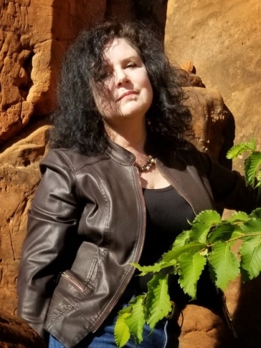 Edited to add one more: I took down some of the yellow in the picture, and vignetted it so the spotlight is on your face, and the rest of the picture is darker. 
| |||
|
| (self-titled) semi-posting lurker Minor Deity |
Oooh!! Absolutely lovely!! Yes, great light, looks soft on your skin, beautiful smile, and that red is great on you! This one is a keeper for sure!! I think this would work on a book jacket or a faculty bio page. ETA I’m referring to the close up with red jacket, no glasses, one post above this one.
| |||
|
Minor Deity |
Eight. 
| |||
|
| Powered by Social Strata | Page 1 2 3 4 5 6 |
| Please Wait. Your request is being processed... |
|